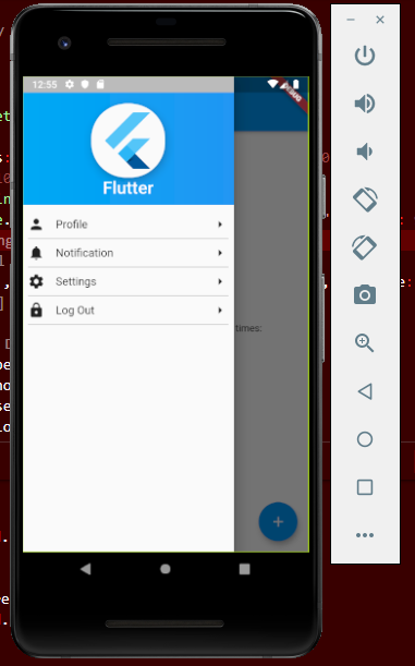
In this exapmle, we will learn how to add customize material drawer with some cool UI look as well as some ripple effect just like below:

Couple of things we should have on our machine prior to implement this functionality:
- Enviornment setup on VS Code: Follow my previous post
- Create New Project: Follow my previous post
Now, Follow the below steps:
- Once you have your project created, then you will notice in the project structure we have 'Main.Dart' file.Go to 'Main.Dart' file and add below class and name it CustomListTile
- class CustomListTile extends StatelessWidget{
- final IconData icon;
- final String text;
- final Function onTap;
- CustomListTile(this.icon, this.text, this.onTap);
- @override
- Widget build(BuildContext context){
- //ToDO
- return Padding(
- padding: const EdgeInsets.fromLTRB(8.0, 0, 8.0, 0),
- child:Container(
- decoration: BoxDecoration(
- border: Border(bottom: BorderSide(color: Colors.grey.shade400))
- ),
- child: InkWell(
- splashColor: Colors.orangeAccent,
- onTap: onTap,
- child: Container(
- height: 40,
- child: Row(
- mainAxisAlignment : MainAxisAlignment.spaceBetween,
- children: <Widget>[
- Row(children: <Widget>[
- Icon(icon),
- Padding(
- padding: const EdgeInsets.all(8.0),
- ),
- Text(text, style: TextStyle(
- fontSize: 16
- ),),
- ],),
- Icon(Icons.arrow_right)
- ],)
- )
- ),
- ),
- );
- }
- }
- Lets talk about CustomListTile class, which we have just implemented. we have inherited this class from StateLessWidget which is a class of widget that does not require mutable state. A stateless widget is a widget that describes part of the user interface by building a constellation of other widgets that describe the user interface more concretely. The building process continues recursively until the description of the user interface is fully concrete (e.g., consists entirely of RenderObjectWidgets, which describe concrete RenderObjects). to make it more generic, we have three objects(Icon Type, Text, Action for onTap()) and one constructor which takes these as parameter which we are using while calling this class object. Like we did it below:
- CustomListTile(Icons.person, 'Profile', ()=>{}),
- CustomListTile(Icons.notifications, 'Notification', ()=>{}),
- CustomListTile(Icons.settings, 'Settings', ()=>{}),
- CustomListTile(Icons.lock, 'Log Out', ()=>{}),
- More in this class you have below implementation of InkWell class which is a rectangular area of a Material that responds to touch. For a variant of this widget that does not clip splashes.The highlight is a rectangle the size of the box. The InkWell widget must have a Material widget as an ancestor. The Material widget is where the ink reactions are actually painted. This matches the material design premise wherein the Material is what is actually reacting to touches by spreading ink. Just Like below
- child: InkWell(
- splashColor: Colors.orangeAccent,
- onTap: onTap,
- child: Container(
- height: 40,
- child: Row(
- mainAxisAlignment : MainAxisAlignment.spaceBetween,
- children: <Widget>[
- Row(children: <Widget>[
- Icon(icon),
- Padding(
- padding: const EdgeInsets.all(8.0),
- ),
- Text(text, style: TextStyle(
- fontSize: 16
- ),),
- ],),
- Icon(Icons.arrow_right)
- ],)
- )
- Edit build method and paste below code:
- @override
- Widget build(BuildContext context) {
- // This method is rerun every time setState is called, for instance as done
- // by the _incrementCounter method above.
- //
- // The Flutter framework has been optimized to make rerunning build methods
- // fast, so that you can just rebuild anything that needs updating rather
- // than having to individually change instances of widgets.
- return Scaffold(
- appBar: AppBar(
- // Here we take the value from the MyHomePage object that was created by
- // the App.build method, and use it to set our appbar title.
- title: Text(widget.title),
- ),
- drawer: Drawer(
- // Add a ListView to the drawer. This ensures the user can scroll
- // through the options in the drawer if there isn't enough vertical
- // space to fit everything.
- child: ListView(
- children: <Widget>[
- DrawerHeader(
- decoration: BoxDecoration(
- gradient: LinearGradient(colors: <Color>[
- Colors.lightBlue,
- Colors.blue
- ])
- ),
- child: Container(
- child: Column(
- children: <Widget>[
- Material(
- borderRadius: BorderRadius.all(Radius.circular(50.0)),
- elevation: 10,
- child: Padding(padding: EdgeInsets.all(8.0),
- child: Image.asset("assets/images/drawerHeader.png", height: 90, width: 90),
- ),
- ),
- Text('Flutter', style: TextStyle(color: Colors.white, fontSize: 25.0),)
- ],
- ),
- )),
- CustomListTile(Icons.person, 'Profile', ()=>{}),
- CustomListTile(Icons.notifications, 'Notification', ()=>{}),
- CustomListTile(Icons.settings, 'Settings', ()=>{}),
- CustomListTile(Icons.lock, 'Log Out', ()=>{}),
- ],
- ),
- ),
- body: Center(
- // Center is a layout widget. It takes a single child and positions it
- // in the middle of the parent.
- child: Column(
- // Column is also layout widget. It takes a list of children and
- // arranges them vertically. By default, it sizes itself to fit its
- // children horizontally, and tries to be as tall as its parent.
- //
- // Invoke "debug painting" (press "p" in the console, choose the
- // "Toggle Debug Paint" action from the Flutter Inspector in Android
- // Studio, or the "Toggle Debug Paint" command in Visual Studio Code)
- // to see the wireframe for each widget.
- //
- // Column has various properties to control how it sizes itself and
- // how it positions its children. Here we use mainAxisAlignment to
- // center the children vertically; the main axis here is the vertical
- // axis because Columns are vertical (the cross axis would be
- // horizontal).
- mainAxisAlignment: MainAxisAlignment.center,
- children: <Widget>[
- Text(
- 'You have pushed the button this many times:',
- ),
- Text(
- '$_counter',
- style: Theme.of(context).textTheme.display1,
- ),
- ],
- ),
- ),
- floatingActionButton: FloatingActionButton(
- onPressed: _incrementCounter,
- tooltip: 'Increment',
- child: Icon(Icons.add),
- ), // This trailing comma makes auto-formatting nicer for build methods.
- );
- }
- }
- In the above code we have added one child container inside out ListView, which has our code for having image in DrawerHeader just like below:
- child: Container(
- child: Column(
- children: <Widget>[
- Material(
- borderRadius: BorderRadius.all(Radius.circular(50.0)),
- elevation: 10,
- child: Padding(padding: EdgeInsets.all(8.0),
- child: Image.asset("assets/images/drawerHeader.png", height: 90, width: 90),
- ),
- ),
- Text('Flutter', style: TextStyle(color: Colors.white, fontSize: 25.0),)
- ],
- ),
- )),
- I have used borderRadius to make the image rounded and elevation is the shadow effect of the image. You can play around with these to observe the changes.
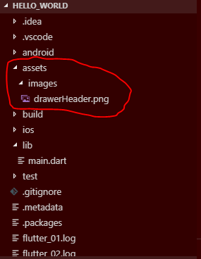
- Create a folder in the root directory, name it 'assets' and create another folder inside it, name it 'images'. It should look like below folder stucture and paste one image which you want to add in the header section of drawer. Mind the name of the file.

- Every pub package needs some metadata so it can specify its dependencies. Pub packages that are shared with others also need to provide some other information so users can discover them. All of this metadata goes in the package’s pubspec: a file named pubspec.yaml that’s written in the YAML language.Go to root directory and find file 'pubspec.yaml'.
- Supported fieldsA pubspec can have the following fields:nameRequired for every package.versionRequired for packages that are hosted on the Pub site.descriptionRequired for packages that are hosted on the Pub site.author or authorsOptional.homepageOptional. URL pointing to the package’s homepage (or source code repository).repositoryOptional. URL pointing to the package’s source code repository.issue_trackerOptional. URL pointing to an issue tracker for the package.documentationOptional. URL pointing to documentation for the package.dependenciesCan be omitted if your package has no dependencies.dev_dependenciesCan be omitted if your package has no dev dependencies.dependency_overridesCan be omitted if you do not need to override any dependencies.environmentRequired as of Dart 2.executablesOptional. Used to put a package’s executables on your PATH.publish_toOptional. Specify where to publish a package.
- Go to root directory and find file 'pubspec.yaml'.
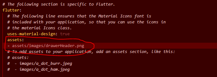
- edit the below line and the entry for your assest which is our image in our example. Mind the Tab because it will give exception otherwise:
- flutter:
- # The following line ensures that the Material Icons font is
- # included with your application, so that you can use the icons in
- # the material Icons class.
- uses-material-design: true
- assets:
- - assets/images/drawerHeader.png

- Now press F5 to run the application and you should have new customize material drawer just like below:

You have done it. feel free to ping me if you face any issue.
Comments
Post a Comment